I led the modernisation of the Newspack brand, creating a refreshed identity that feels contemporary, confident, and rooted in the energy of publishing.
This work included:
Logo system
Refined the symbol and wordmark, and created alternate versions (stacked, contrast-based) to ensure the brand adapts seamlessly across digital and print contexts.
Typography
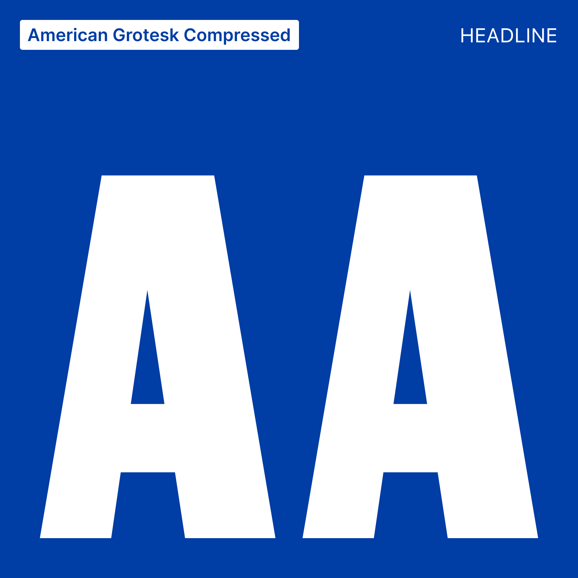
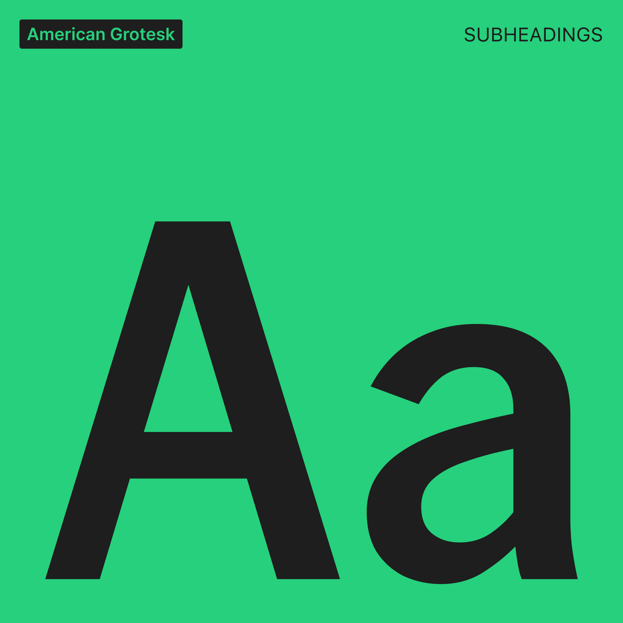
Introduced a new type hierarchy combining American Grotesk Compressed for bold headlines, American Grotesk for structure, and Inter for clarity in body text and UI. This system draws on the visual language of newspapers while remaining highly accessible.
Colour palette
Expanded and documented a modern palette, integrated directly into our Design System for consistency across product and marketing.
Brand site
Designed and built a dedicated internal site to serve as the single source of truth for the brand. It houses guidelines, principles, and downloadable assets, making it easy for the team and partners to adopt.